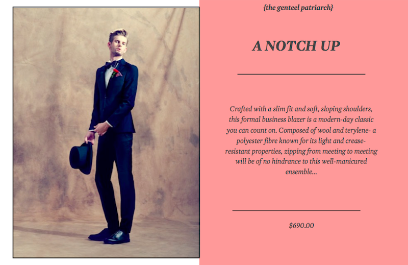
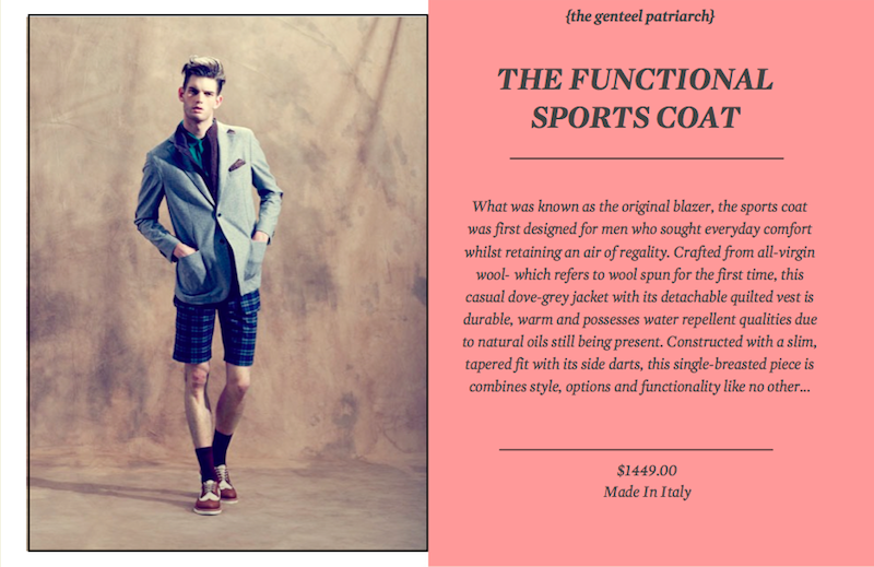
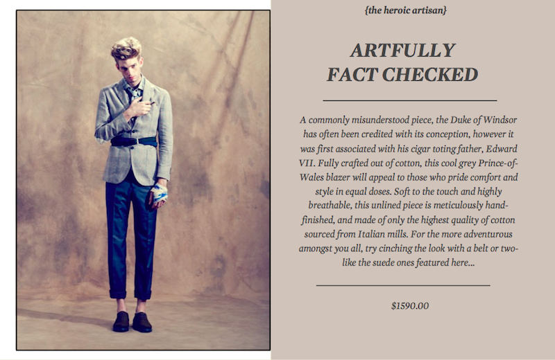
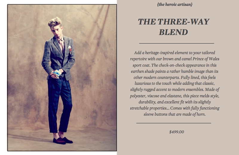
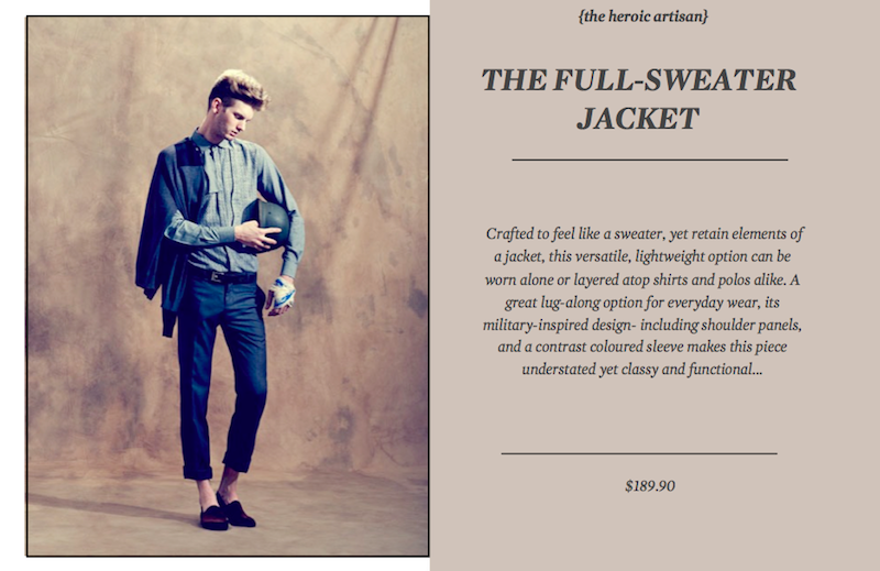
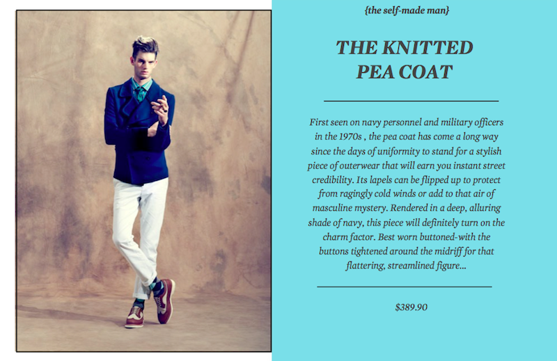
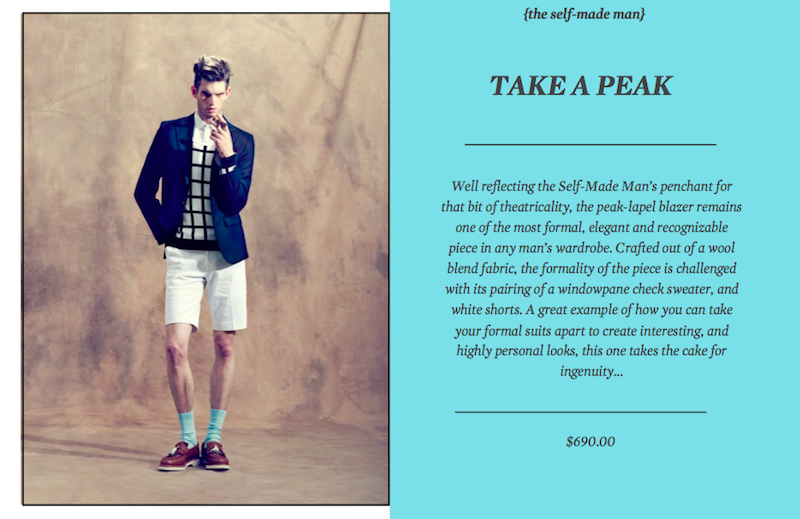
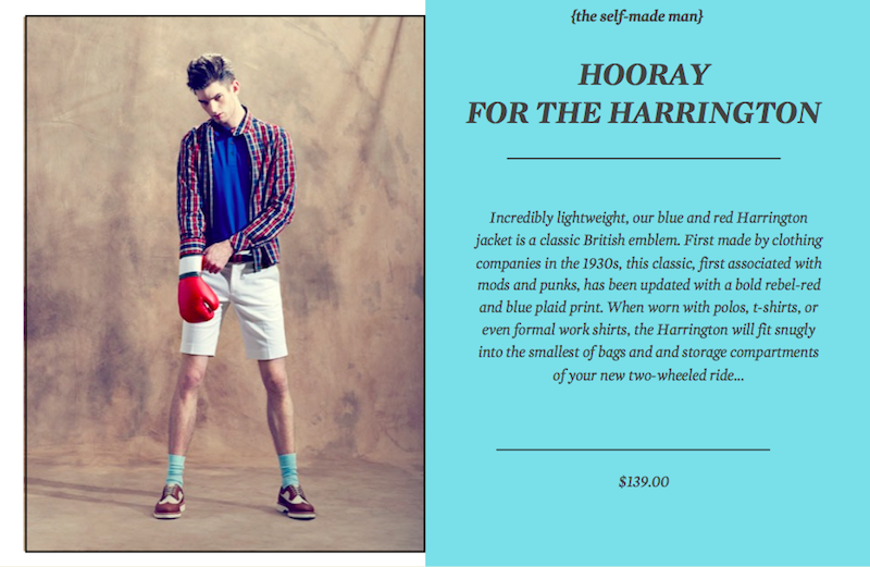
An instant perk-me-up, a sharply tailored outer coat is your answer to sprucing up any given look. Be it a formal business blazer, a wool blend trench, or a casual, lightweight Harrington, a jacket is easily a man’s best bet- for any occasion, any time…


Tags: Feature, Jacket, Menswear, Sartorial, Style
September 1st, 2013
Posted in Features
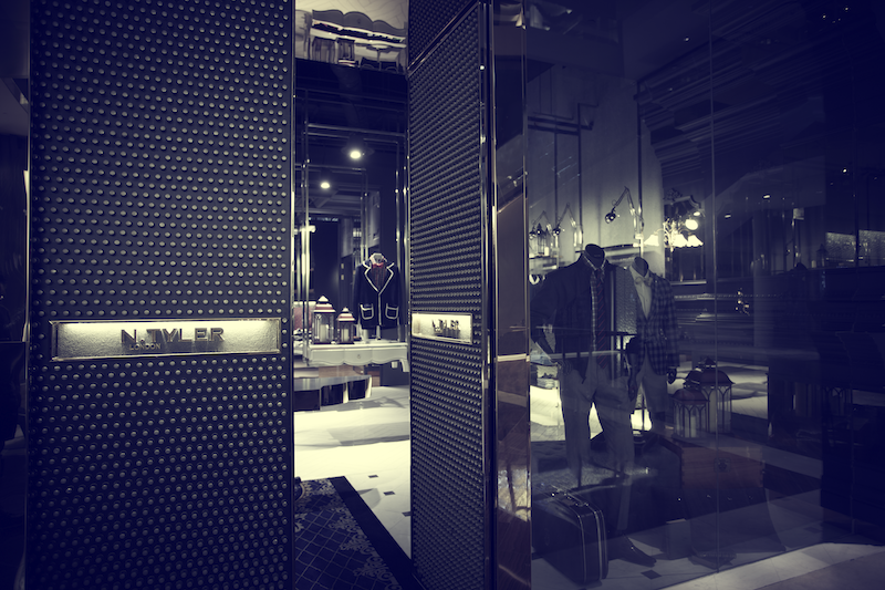
Described as a ‘curious Savile Row’, N.Tyler’s flagship boutique at Marina Bay Sands is a dream come through for any dapper gent who has his pulse on the finer things in life. Likened to a modern-day shrine for menswear connoisseurs, the 150m’ boutique is a richly put-together space that well reflects the N.Tyler’s British roots and modern, sophisticated sensibility. Designed by multi-disciplinary creative agency, UPSTAIRS_, founder Dennis Cheok talks us through the inspiration and intricacies of the store, challenges faced and personal thoughts on menswear..
What was the main consideration(s) when designing for the N.TYLER boutique at MBS?
N.Tyler is a Savile Row-inspired menswear label defined by contemporary cuts and modern silhouettes.
For their inaugural flagship boutique located at the prestigious Moshe Safdie-designed Marina Bay Sands, we were given carte blanche to translate the dynamic of the brand into a lifestyle-inspired retail environment.
We wanted to communicate a sense of luxury, along with a nod to the fashion label’s British aspirations and, more quintessentially, to the craft of tailoring.
What were some of the sources of inspiration?
Inspired by the controversial works of British artist Damien Hirst, we’ve created a modern-day shrine for the menswear connoisseur.
We wanted to expose the artifice of recreating something so traditional within a modern and foreign context, and craft a unique brand experience out of that synergy.
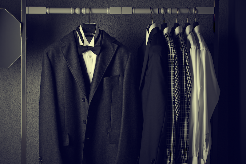
How did the design team translate the essence of N.TYLER to its interiors?
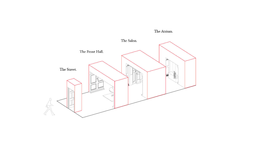
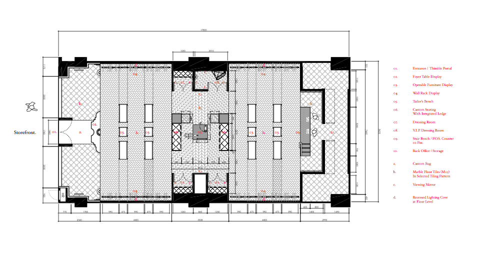
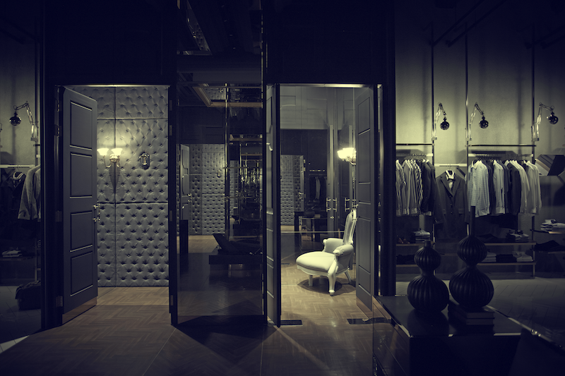
The design process became a curious and slightly crazed exercise in abstracting the peculiarities of a traditional English Row House, with the intention to create a series of highly charged & meticulously art-directed experiences. Within the long and deep shoebox floor plate, we have created a linear spatial sequence that guides visitors through a Row House and into its 3 archetypal spaces.
The Front Hall is the first thing one sees as one enters the store and it also serves as an immersive backdrop for the evolving displays. The Salon is the centrepiece and contains a bespoke tailor’s pedestal and dressing rooms, while the Stair Atrium is a transitional area where one makes his final transactions before leaving the store.
We fervently dissected, curated and reconfigured them all as total, holistic, full-scale environments, each with its own authentic details and grandeur.


What was the greatest challenge(s) faced?
This project required a dramatically intricate approach to traditional ornamentation. The number of furnishings we had to source for and the degree of customization went way beyond what we had expected.
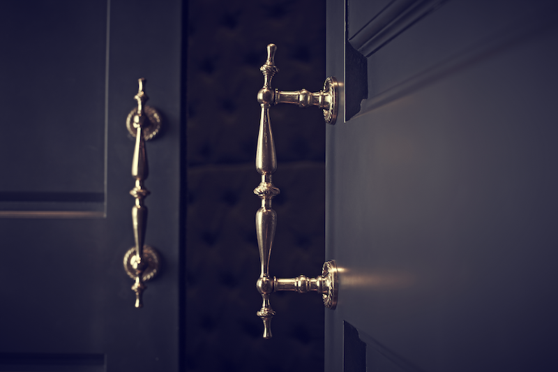
Because of this, we had to exercise a great deal of restraint with regards to materials and colours. All surfaces were spray-painted in neutral greys and set against a raw concrete background. Brass accents also create the desired air of sophistication.
The creative freedom we enjoyed ultimately led to a result that fully lived up to our expectations, both in terms of overall quality and detailed specifications. The only regulations and restrictions we had to consider were those that applied to the safety procedures of the Mall.
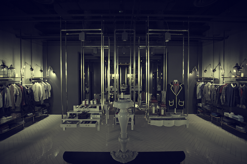
Tell us more about the features and key highlights of the store.
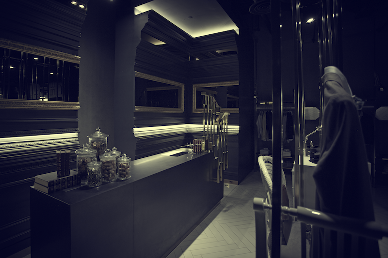
We designed every single element from the walls, to the furniture, right down to the shoeshine stand – even the vintage furniture and lighting pieces were dissected and re-finished.
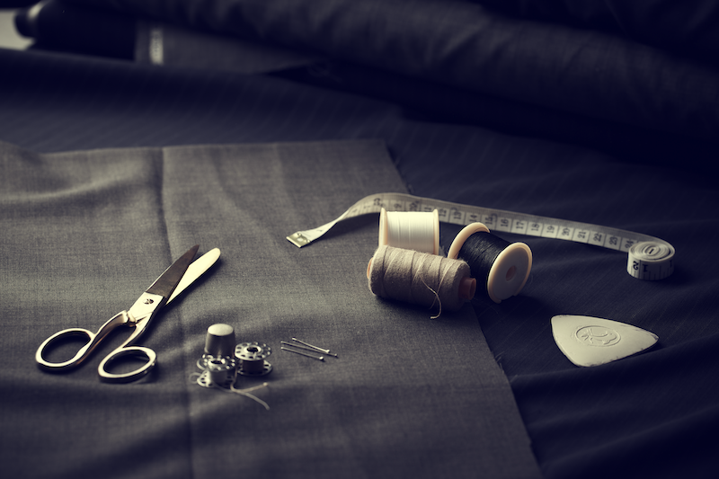
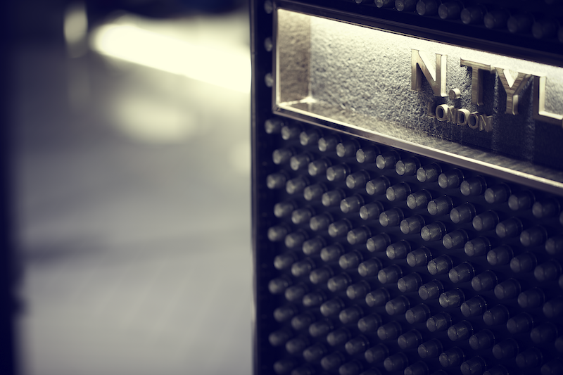
Every single detail within the space is created as a nod to the fashion label ’s British origins, or more quintessentially, the craft of tailoring- from the herringbone patterns on the floors, to the doors studded with thousands of sewing thimbles, and finally, the centre-piece for the boutique –a bespoke tailor’s pedestal anchored beneath a dramatic, carved mirrored ceiling vault.
We also created dissected “archways” as a spatial narrative through the shoe-box floor plan. Interspersed with floating dreamlike galleries of fragmented pedestals and truncated carved legs, the result is a bespoke retail experience we call “The Curious Savile Row”.
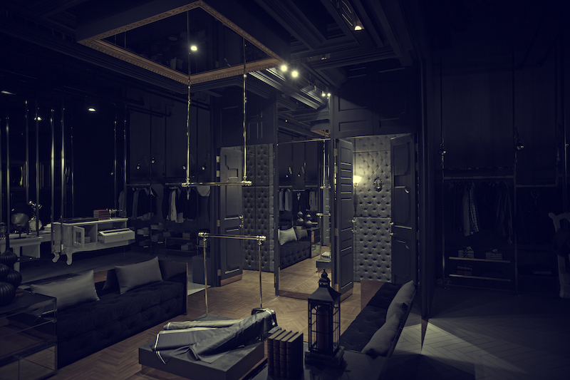
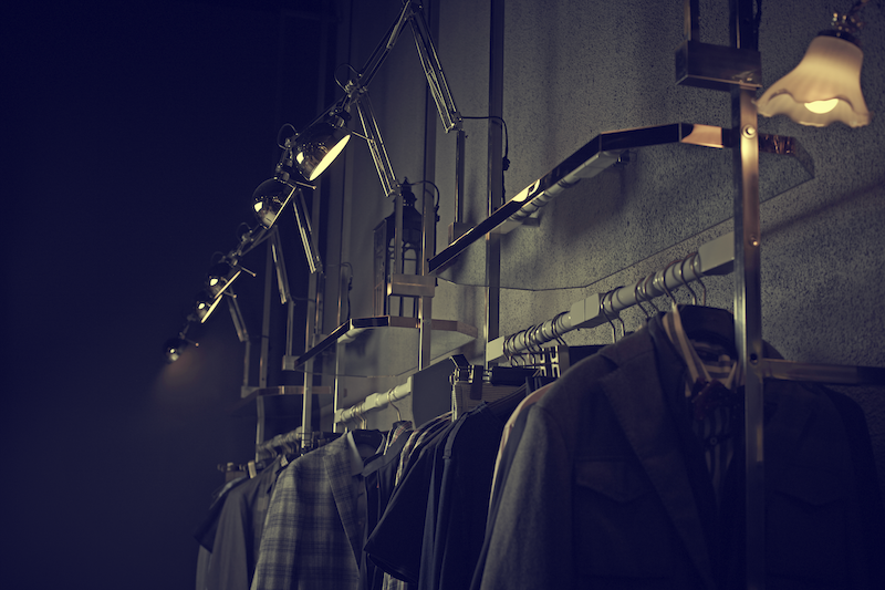

What are the key emotions you would want the end consumer to feel when experiencing the store?
As a design studio, we’re constantly seeking a good story, one that lends the brand its definitive quirk and personality.
For N. Tyler, we wanted to craft a brand experience that not only is distinctive and a concept-driven representation of the fashion label, but also one that is deeply steeped in the brand’s roots and heritage.
How would you describe N.TYLER in three words?
Tailoring. In. Style.
What was the most expensive fixture?
The material palette was a mix of humble, honest materials (like timber and concrete), contrasted with what is considered more premium, luxe accents. (like marbles and polished brass).
However, the most costly aspect was not so much the materials, but the extensive manual labour work involved. Countless man-hours went into crafting the intricate ornamental woodwork for the walls and ceilings.
Are there any standout designer pieces you’d like to mention?
We are especially proud of all of the vintage furniture pieces that we have sourced, refurbished and finished with new paintwork and brass hardware.
We also love the bespoke pieces we designed for the space – the tailor’s tool plinth and shoeshine stand, the “Dissected Chesterfield” chaise lounge, and the “Dissected Stair” counter with its brass-work baluster.
How long did the entire renovation works take?
The entire fit-out was completed within 6 weeks, which was a real feat considering extensive detailing involved.
Based on your design ethos, what are, in your opinion, key aspects of menswear every man should appreciate and understand? (eg. cut, material etc…) And why?
The further I come along of age, the more I start to appreciate the quality of material, cut and workmanship. These are after all, the basic qualities of a well-dressed individual.
It’s only when the basics are covered, do we begin to explore territories like proportions and style, in order to find our own personal voice.
Of course, the process is never as linear in reality. It’s exactly like design, actually.
What do you think is a key item every man should have in their wardrobe? And why?
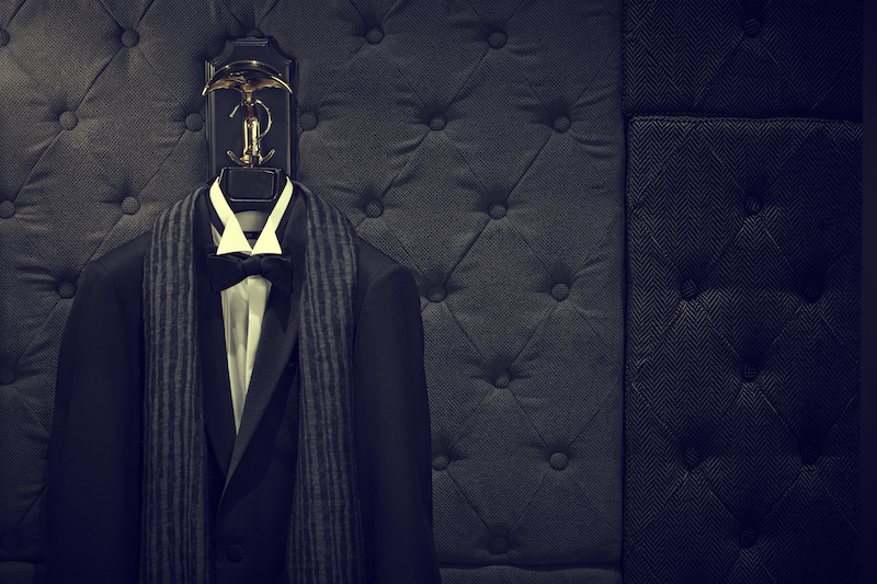
A simple, yet well-cut blazer can take you to many places.
What does personal style mean to you?
The ability to use dress as a tool, and create something personal out of it.
About UPSTAIRS_
UPSTAIRS_ is a multi-disciplinary creative studio that explores the realms of art, fashion, graphics, and space. Constantly seeking a good story and melding emotions and rational pragmatism in their designs, the company seeks to build a full-fledged think tank with diverging capabilities. UPSTAIRS_ has worked on projects ranging from retail to F&B to hospitality to branding to product design to art installations, theatrical sets and fashion.
N.TYLER is located at 2 Bayfront Avenue #B2-118, The Shoppes at Marina Bay Sands, Singapore.
Tags: Boutique, Dennis Cheok, Design, Flagship Store, Interior Design, Interview, Marina Bay Sands, MBS, N.Tyler, Upstairs
June 30th, 2013
Posted in Features
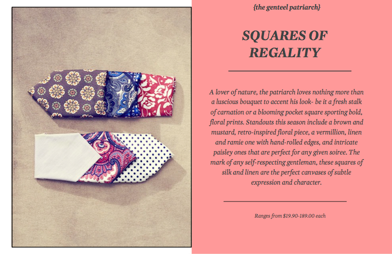
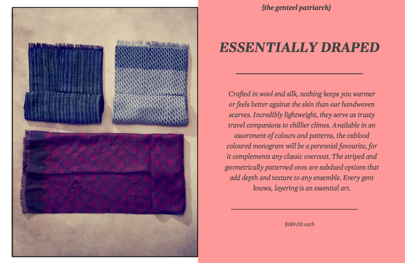
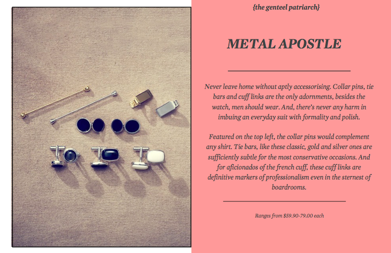
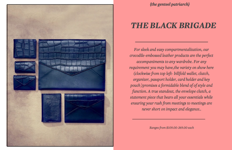
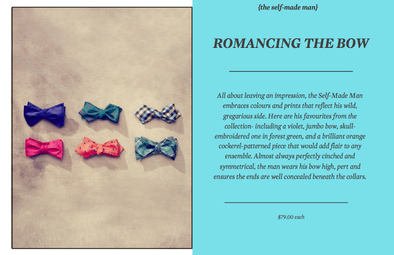
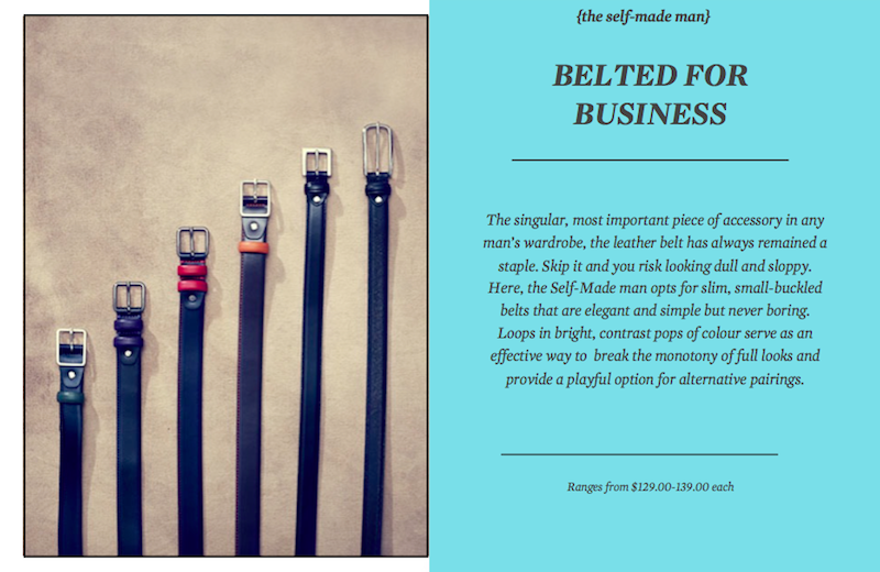
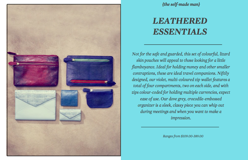
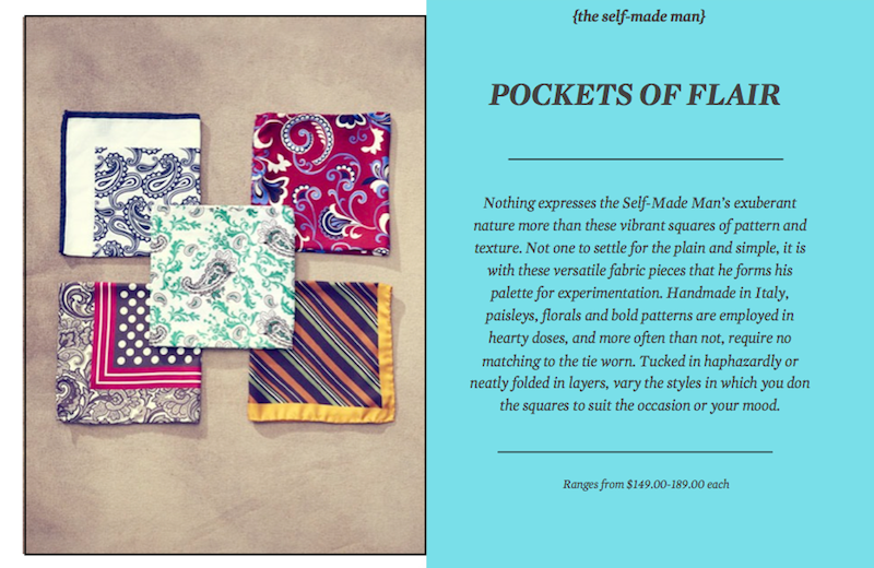
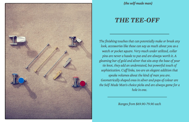
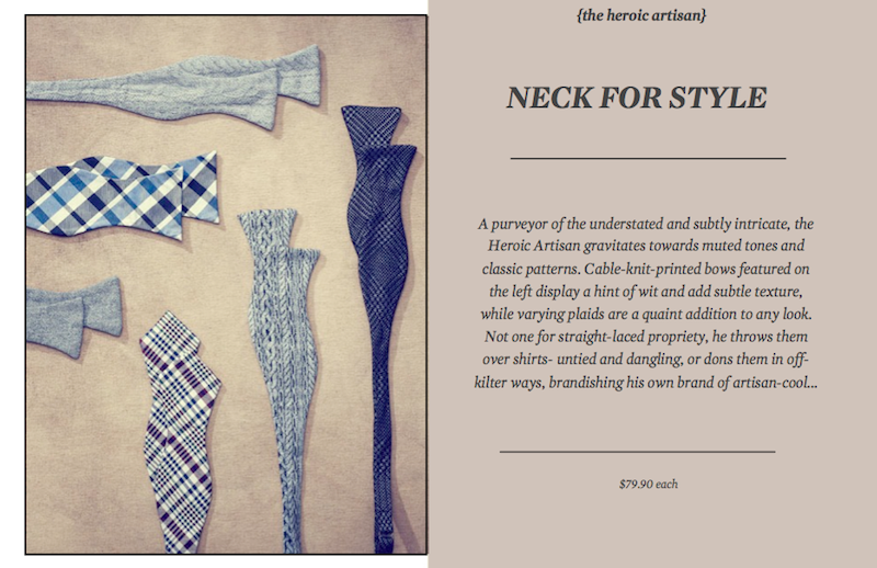
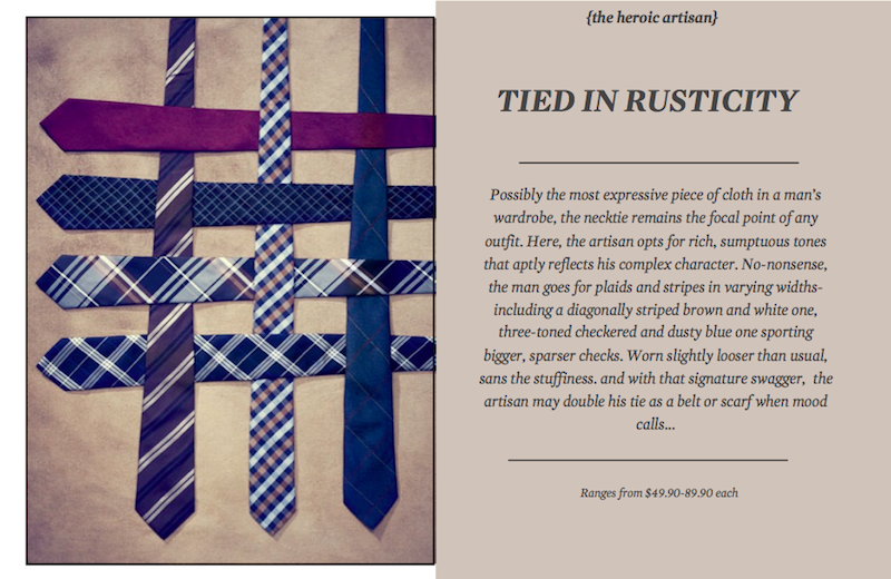
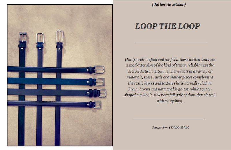
Whether purely practical or for embellishment’s sake, accessories elevate any wardrobe and are marks of individual expression. Chosen well, they not only display discernment and style, but also subtle wit. Read on for a grand tour of the accessories this season- where each archetype singles out their choice pieces …


Tags: Accessories, Feature, Menswear, Spring Summer 13, Style, Tips
May 9th, 2013
Posted in Features
“An exploration of the archetypes of men past and present, this season’s campaign pays homage to the men that live and breathe amongst us- three individual characters that typify the pillars of masculinity. With our roots in traditional tailoring and a rich British sensibility, we seek to amplify the sartorial qualities of our clothes through the portrayal of men in various fields and lifestyles.”
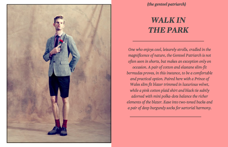
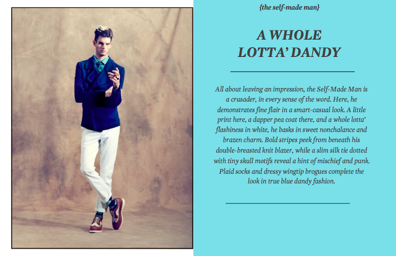
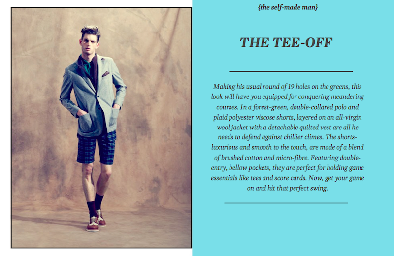
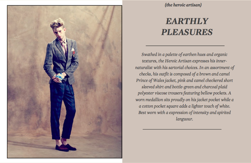
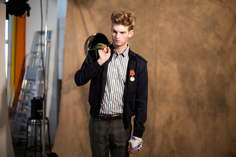
Fronting the campaign is English model, Matt King, a lanky young man who imbues the brand with a refreshed spirit of youthfulness and gusto. With his chiseled good looks, intensity of expression and adaptability, the man takes on three different personalities with panache. Here, allow us to introduce the Genteel Patriarch, Self-Made Man and Heroic Artisan.


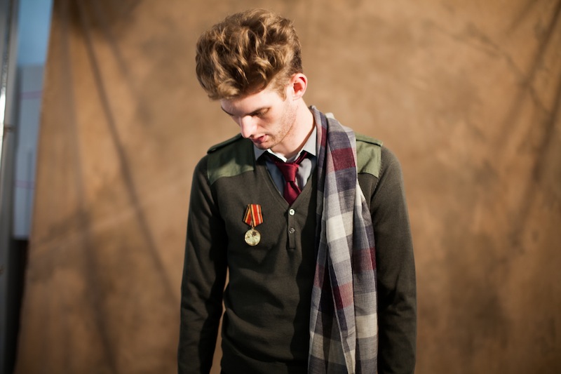
With a textured, tea-stained canvas forming the backdrop of the shoot, images come alive with a rich, romantic quality. Hard lighting is employed to create greater contrast, enhancing the colours and textures of the clothes while amplifying the inner strength of the men in play. Shadows add a sense of intrigue- highlighting the complexity and faceted nature of the various personas.
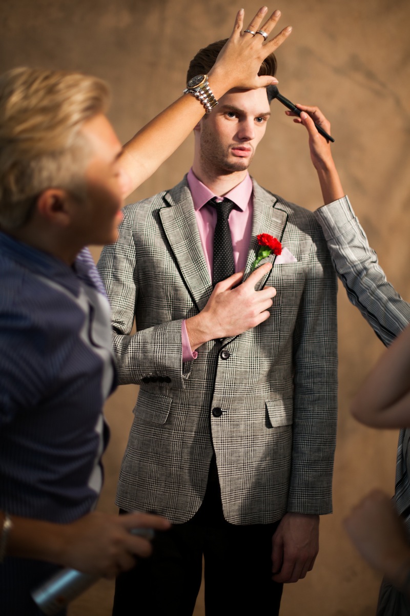
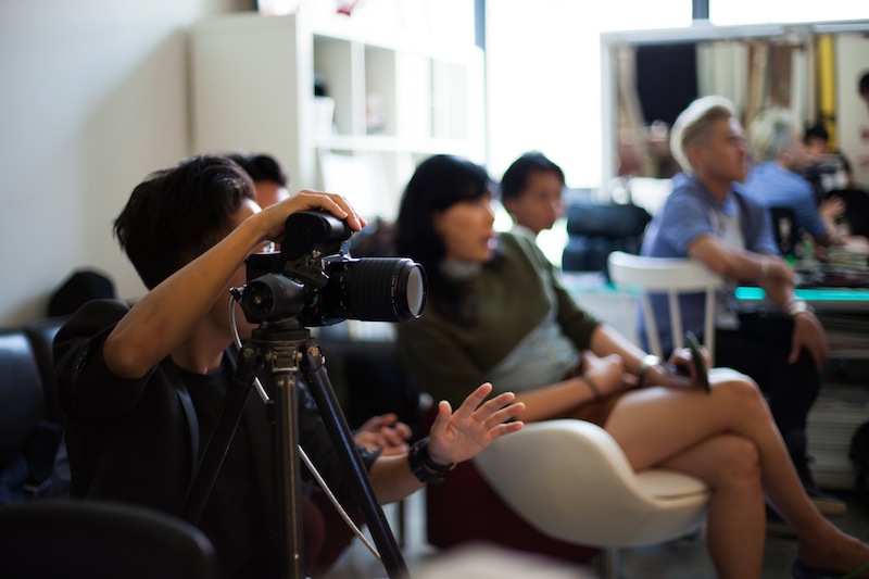
With three distinct hair changes, and a variety of props in place to complement the archetypes, the studio was abuzz with good energy and excitement. Styling was also carefully considered to suit the personality of each man- from the regal, structured layers of the Patriarch, to the clashing prints and high-impact colours of the Self-Made Man to the slouchy, drapes adorning the Heroic Artisan, each archetype marched to his own unique beat.

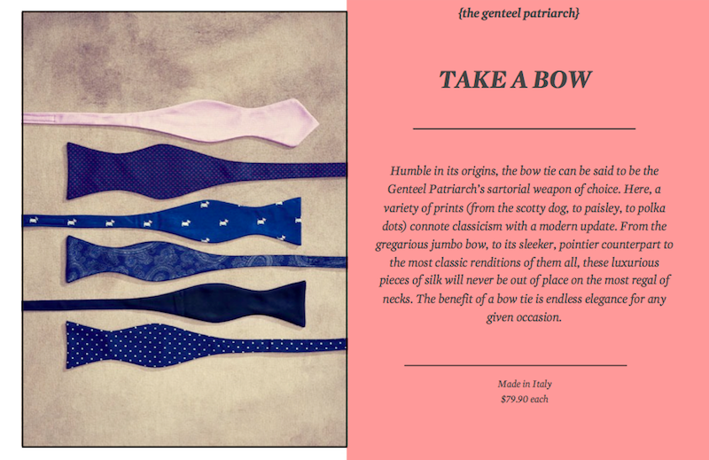
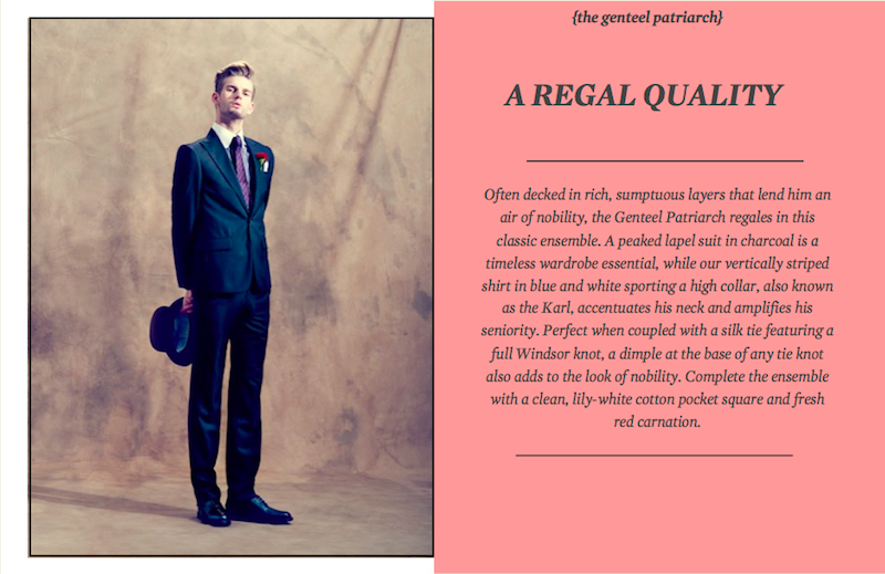
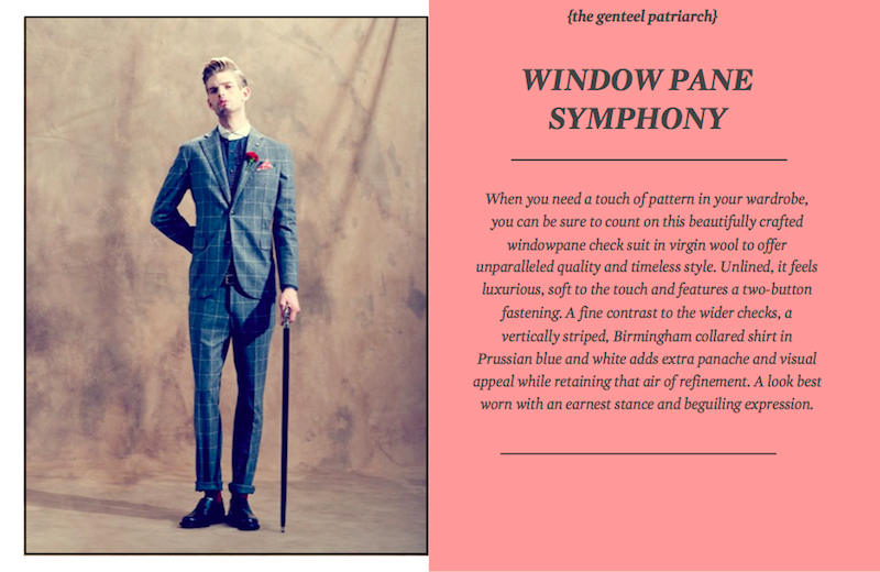
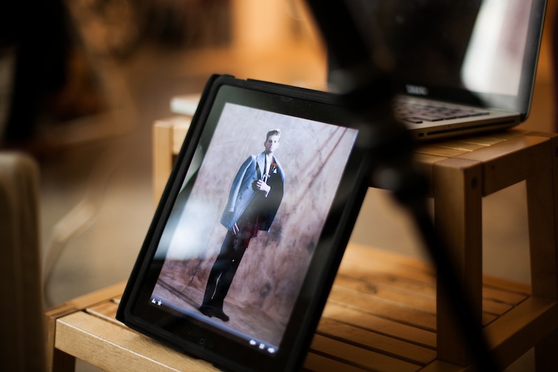
First up- we introduce the Genteel Partriarch, where Matt inhabits an old soul trapped in a youth. A gentleman in his own right, he is the far-sighted, benevolent aristocrat. Decked in sumptuous layers of wool blends and fine cotton, he epitomizes regality and classicism. Never seen without a decorative detail, he adorns his suits with a deep red carnation, strategically placed on the lapel. A silver and black walking stick serves as his weapon of choice, a final touch to his elegant bearing and good-natured ways.


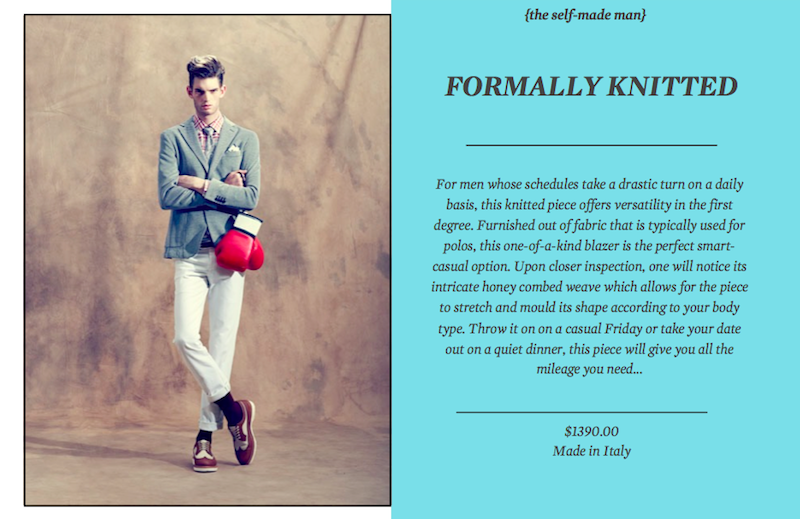
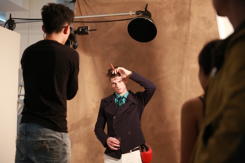
Seven outfit changes later, Matt is transformed into the Self-Made man. A portrait of wealth and success, think of him as a contemporary of Richard Branson or Lapo Elkann. A risk-taking go-getter, he is the connoisseur of all things luxurious and fine. Brash and rash at times, he wears his heart on his sleeve- with flashy colours and highly mixed-and-matched styles forming the bulk of his wardrobe. A pea coat is paired with a candy-striped shirt and white pants, while pastel-hued socks and polished brogues complete the look. Props like boxing gloves, a glass with whiskey and newspapers raise the stakes a notch higher.


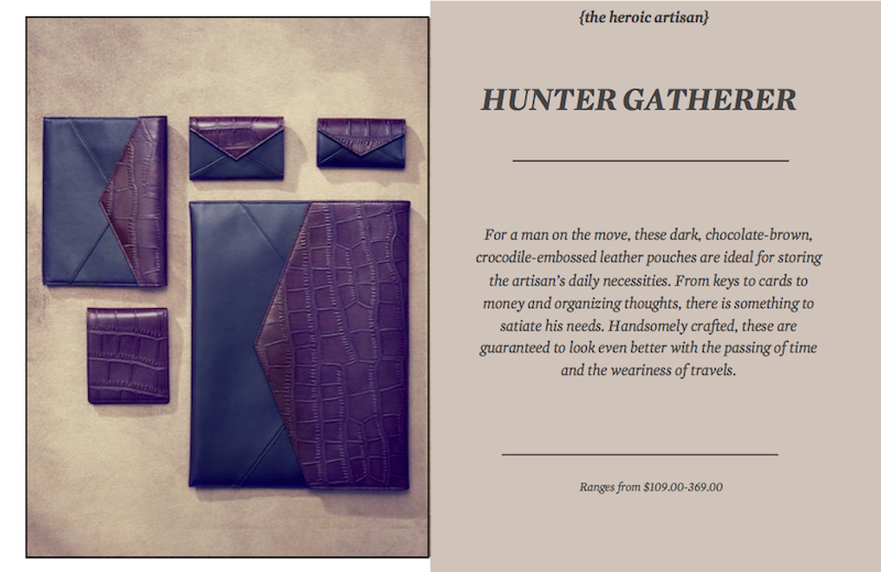
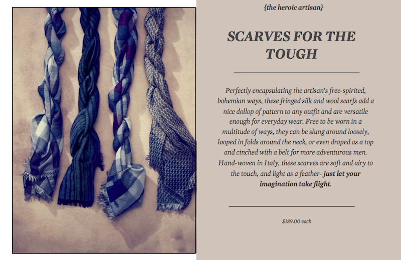
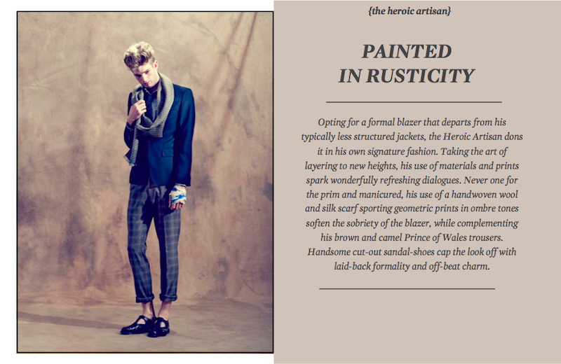
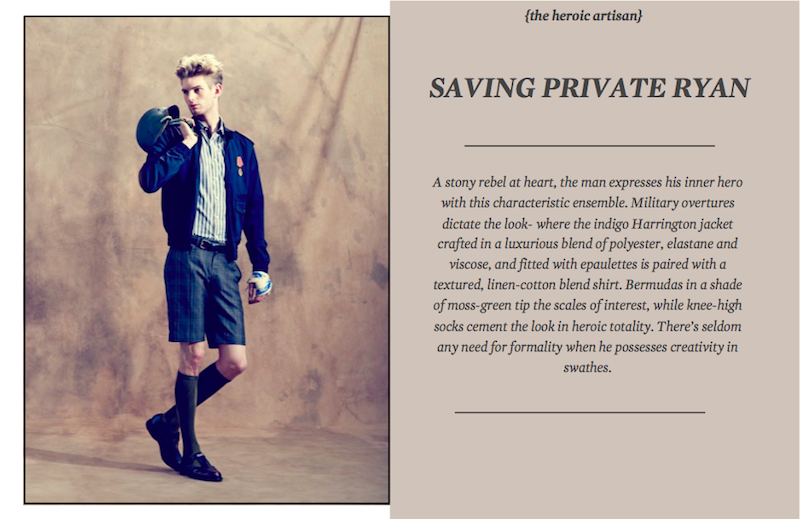
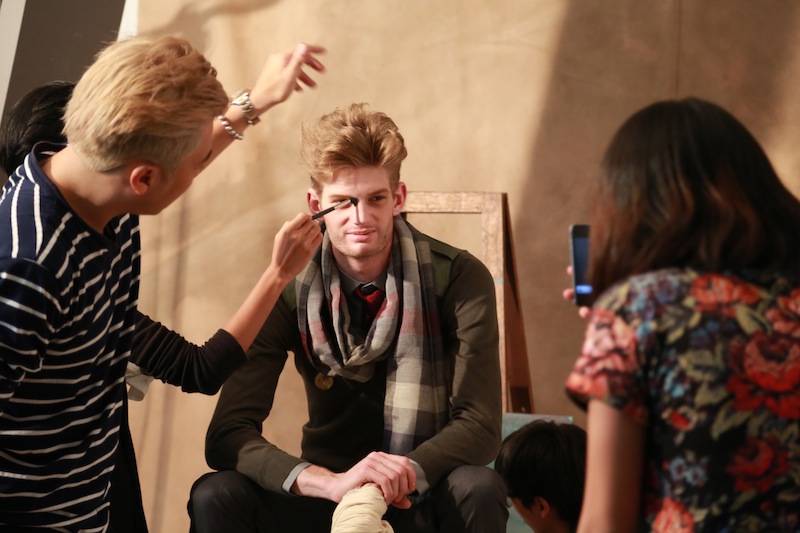
Next, Matt’s sleeked and parted hair is momentarily teased into a voluminous and tousled mop. His facial hair becomes more pronounced while his clothes take on rustic, bohemian layers. Styled to mimic a war-torn hero, a struggling artist and a passionate activist all at once, Matt now assumes the role of the Heroic Artisan. Honest, loyal and civic-minded, he is clad in profound layers and gravitates to rich, earthy tones. Scarves are the choice in his wardrobe, while a vintage medallion pinned to his sweater is a badge of honour he wears with pride.


24 looks later, the shoot comes to an end and the men lay their stories to rest. However, the wise sage, successful entrepreneur and rigourous idealist will continue to live among and in us all.
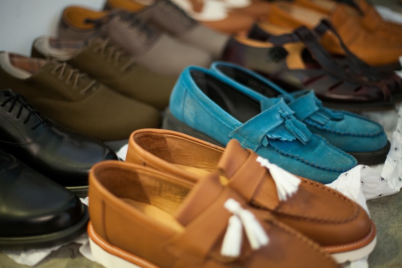
(We’d like to thank the good people from Dr. Martens for their shoes.)
January 23rd, 2013
Posted in Features
